What is a landing page and why are they so important?
Landing pages are solely created to drive traffic, convert visitors to leads, and capture data for your business. They are usually a standalone page, created with one focused purpose in mind – whether that is to generate opt-ins, encourage sales, or increase engagement. But why are they so essential? Landing pages lead people to a specific product, service, or offer, and most importantly, they encourage them to act. And when you consider that 61% of online marketers say generating traffic and leads is their biggest challenge (Hubspot, 2021), you can understand why businesses should utilise landing pages to their full potential.
But whilst landing pages are key for businesses, it is vital that they are designed and built correctly. There is so much to consider here, from data formatting and functionality to customer journey and design. Today, I’m going to focus on the first two of these and give you some key considerations to ensure you’re getting the most from the landing pages you use.
Data format – it’s not enough to just “collect” data.
Now, we all know that the main aim of landing pages is to capture data, but it is not enough to just collect it, it needs to be done in the correct way. But what do we mean by correct? The data needs to be easy to read and manipulate, clean, and match up to the data standards you have in other areas of your business. For example, if you collect the date of birth in the format DD/MM/YYYY on your newsletter sign-up form, but MM/DD/YYYY on your competition landing page, it’s going to become confusing, and likely lead to inaccuracies somewhere along the line. You can read more about that in another recent post of ours here.


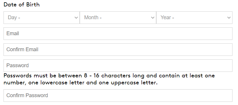
As well as ensuring you stick to the same data standards, you will need to make sure that you are putting in safeguards to limit the number of errors that people make when using your form. These can include asking users to confirm their email twice, using drop downs or radio buttons to provide choices, limiting date of birth fields to use accurate options (for example, year of birth cannot be 2021), and setting up a double opt-in which would require users to confirm their entry/subscription.
How, and by who, will the data be accessed?
As well as ensuring you collect data in the correct format, you need to consider what happens to the data after this. A mistake many people make is creating landing pages on their site or social channels without thinking about who, how, and when to access the data afterwards. There are two ways to access the data from a landing page, either through a manual export that you can go on to add to your marketing platform and/or single customer view, or through an integration with these. There are benefits of both. The former is an easy and quick fix on a limited budget, whilst an integration limits manual work further along the line – particularly useful for a landing page that is going to run for an extended period. But whichever option you choose, you need to ensure the correct people can access the data easily in the time frame required.
Functionality – it’s not just about how they look.


So now we’ve covered some key considerations when it comes to the back end of a landing page and the data it’s collecting, it’s time to think about its functionality – how does it work. One of the most frequent aspects of a landing page design that is often overlooked is optimisation for other devices. This is highlighted perfectly when you consider that over half of all web traffic is now mobile (Statista, 2021) but only 50% of landing pages are optimised for mobile devices (Adobe, 2021). You also need to consider how many fields you want to ask for on your landing page. 11 is the average number of form fields on landing pages but reducing this to 4 fields instead usually results in a 120% increase (PageWiz, 2021). However, you can – and should test to see if this is the case for your business. Setting up A/B testing on landing pages to allow for different versions showing a different number of fields is a great tactic.
This allows some insight into behaviour once people hit your landing page but it’s equally important to be able to track their behaviour before that point – for example, how did they get there? The key thing here is to make sure you add Google Analytics to your landing pages wherever possible as this can provide insight to help monitor both aspects. There are many metrics that Google Analytics can track so that you can better understand how users interact with your landing page. These include sessions, durations, source, completions, and bounce rate. Using Google Tag Manager will enable you to understand landing page conversion rates, including the points at which your users drop off.
Now whilst you may think we’ve covered a lot; these are just a few considerations to think about when building landing pages – there are so many more! And we’ve not even touched on the customer journey or design yet! But that’s for another day. In the meantime, if you have any questions about landing pages or want to learn more, contact us here or sign up to learn more about our eLearning course Winning with Data here.


