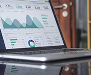
The term “dashboard” originates from the automobile dashboard where drivers monitor the major functions at a glance via the instrument panel (1). You can see how this is similar to what the term “dashboard” means in BI. According to Wikipedia, a dashboard is a type of graphical user interface which often provides at-a-glance views of key performance indicators (KPI’s) relevant to a particular objective or business process. In other usage, “dashboard” is another name for “progress report” or “report” and considered a form of data visualization.
Dashboards are often the best way to gain insight in sport’s industry. When you think of analytics in sports, you probably think of player performance evaluation, scouting, or game-day decisions. Nowadays, football clubs can dive deeper into historical match reports and player performances by studying measures like possession, completed passes, pass accuracy, shots on target and uncovering trends and insights at a team or individual level. Once managers can answer why it happens, it will help to define individual plans and team tactics for the next match, for example.
Microsoft Excel remains the basic platform for creating a dashboard. The capabilities of the program allow you to create interactive charts, graphs and dashboards that will be updated when business indicators change. But Excel is limited in functionality, and analysts use separate programs to import data arrays into a new file. In addition, Excel dashboards are not always intuitively understandable – the visual part depends on the structuring of information.
Those who want to implement the full range of dashboard functionality into their workflow just need to look at the Gartner Magic Quadrant for Analytics and BI Platforms (2):
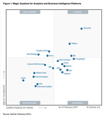

These disadvantages of Excel are compensated for in another Microsoft product – Microsoft Power BI, which is a leader in the “BI world”. Designed specifically for business analysts, the platform offers cloud file sharing and an intuitive interface.
However, I would like to mention another BI leader – Tableau, which, as part of the Salesforce family, offers the world’s leading analytics solution for all your data. Today, Tableau portfolio consists of a whole set of mature solutions all designed for smooth collaboration and visual analytics to understand data.
But, hey, I do not make any ads here – lets go back to the term “dashboard”. When talking about the sport industry specifically, there are seven key areas where dashboards and analytics are used: scouting, player fitness, player development, game-day strategy, player evaluation, ticketing and merchandising (3). With the help of dashboards, users analyse the big picture and compare the results with specific KPIs to understand which ideas work. The functionality of a dashboard depends on the role it plays in organizing business processes. Everyone uses digital analytics dashboards in different ways. And it is important for users to understand which KPIs to track and why.
There are many significant benefits of implementing BI dashboards into your operations. Let’s quickly list several reasons why it is worth doing:
Insights on different data feeds in one dashboard
Manual gathering of information and compiling reports can take weeks and months, while dashboards extract information from the required sources and collate it into one platform. It does not matter where the source is located: in the cloud service, on computers in the local network, or an API. With a nicely set up dashboard a user will not even notice that the data in a chart is coming from different data feeds. For example, by tracking ticket purchases, merchandise sales, food and beverage sales, and compare it with a different data source such as weather, of weekday, the team can find some interesting correlations. For example, it could happen that attendance peaked on Wednesdays, not weekends as they originally thought, or about 80% of all individual ticket sales made up to 3 days prior to event.
Data is up to date
By the time the data is collected and a manual report is produced the data is often no longer relevant and already outdated. On the other hand, dashboards can show the information which is actual at the moment of viewing. However, the “freshness” of data will depend on the data feed, where it is stored and frequency of update. Once a day update can work for a team manager but might be not enough for sales department. For instance, a coach assistant may need information related to injury, training intensity, training loads, performance in matches only three times per week. On the other hand, marketing and sales team might want to track those marketing activities in dashboard and how they are impacting sales every hour — from CRM to social media.

Reducing human mistakes
When doing manual reporting and data collection there is a high chance of making a mistake, since we are all human and no one is immune from this. Fatigue, lack of concentration, attentiveness affects the number of mistakes. If the report is prepared by more than one person, then the number of possible errors increases by the same amount. In dashboards, there are practically no errors with an accuracy of 99.9%. Errors in dashboards can only happen if they were already in the database or other sources of information.
Better visibility and interactivity
Imagine you have a 360-degree view of the stadium with sectors each marked in red-amber-green depending on STH tickets sold. BI dashboards provide greater visibility with information available whenever it is required. Precious data is shown in different ways from tables and charts to arrow indicators. Traditionally, dashboards include tables, dynamic charts and maps. The data can be grouped and aggregated with a possibility to apply filters and sorts at different levels, cut data by top values, create calculated fields of almost any complexity. Rather than providing static information, you and your users can filter data and interact with charts to see changes over time.
Terabytes of data in your pocket
Yes, you are right. I joined two benefits together, but just listen to how powerful it is – terabytes of data in your pocket! Thanks to rapidly growing technology, clubs can use big data to transform it into actionable insights. Despite the size of the source, it can only take seconds for BI platform to process the data and display it in a dashboard in a pre-defined form. Now, back to the final part about a “pocket”. Nowadays, most dashboards software are programmed to suit any mobile device. Imagine how it can simplify coaches’ job – he can access the necessary report – player health, training data, stats on competitors or referees, on his tablet from anywhere, without sacrificing time with players out on the field.
The benefits of implementing BI dashboards into your sport’s organisation far outweigh the limitations. Immediate access to actionable insights are the key pros – getting the necessary information through several clicks is much easier than poring through rows of records in an excel sheet.
If you want to better understand how dashboards could be used in your organisation, or you would like to discuss how our clients have successfully added them to their decision making, feel free to get in touch.

