I’m often asked how I define data visualisation so here’s my description – see what you think: It’s the visual presentation of data, using graphs, charts, or other formats.
What are the Benefits of Data Visualisation?
That’s really easy, to sum up – data visualisation enables:
- Communication of information clearly and efficiently
- Easier and quicker analysis and assessment of situations
- The identification of patterns or trends
- Complex and copious datasets become more accessible.
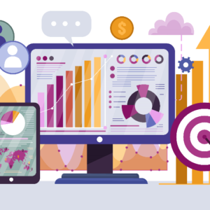
Data visualisation nowadays
The first example we have of statistical data visualisation is a 1644 diagram by cartographer Michael Van Langren’s showing estimates of the difference in longitude between the Spanish city of Toledo and Rome.

Fast forward to 2020 where data is widely used and considered inherent to a successful business, and data analytics and visualisation go hand-in-hand – we analyse data but to present our findings, the “actionable insights”, we need to communicate it in the way our brains want to process it.
Why is visualisation important?
The importance of data visualisation can’t be understated. They say visual aids can improve learning by up to 400% and that we can process visuals up to 60,000 times faster than we can process text, so when it comes to ensuring we get value from our data work, and that our management and marketing teams can make the appropriate decisions, we need to ensure it’s as easy as possible for them to see the insights we’re producing for them.
Types of data visualisation
Choosing the right chart for your particular message is important. Different views do a better job than others at presenting the information. Graphs and charts should be used to show the information about data relationships, patterns or how things are changing over time. Tables should be used when you must show precise value, and numeric data is best presented using dots, lines, or bars if you’re looking to present a quantitative message. Maps are used when a physical location is key to the information you’re presenting, and heat maps are used when different values within a map are shown using colours.
You might be asking when we use data visualisation – here are a few examples:
1) Population mapping which is exactly as it sounds – it’s about putting your database on a map, providing a visual image of where your fans and your customers are, either around the world or within your country, or even around your stadium.


2) Another great example of visualisation is when we use trend lines and in this example, below, we’re showing you what we call a ticketing trend line. What we’re showing you here is the pace at which tickets are purchased, starting at the left from the minute tickets go on sale, right up to the day of the event and you can see that red line shows peaks and troughs in ticket sales.

3) This next one looks at customer churn and retention with churn represented with the black line as the people that are no longer in your environment, no longer renewing their season tickets, no longer registering to participate, no longer buying casual tickets, etc. And you can see the retention in gold and it’s those customers that you’re managing to retain, that are staying with you, buying from one match to another, participating one year to the next, or buying a season ticket from one season to another.

The most important point about data visualisation is knowing which questions needs to be asked and then identifying the answers that are going to make the difference. As with everything we talk about when using data, it comes down to six words – what are you trying to achieve?
You can learn more about the practical use of data visualisation in our eLearning course Winning with Data. Find out more. If you want to understand specific chart types and their uses, you can proceed here.
You can also read about related topics, a Single Customer View and Data-Driven Marketing, in our blog.